Branding of the architectural bureau Porcelli Group


Freshly squeezed juice from Sicilian oranges, a Vespa instead of a black Mercedes and a slightly relaxed atmosphere, like a linen shirt unbuttoned a couple of buttons at the top, the atmosphere. This is not a still of another TV series about Italian family passions, but an image of a remarkable company in Krasnodar. But when it comes to business, the shirt becomes white, laptops appear on tables instead of glasses, and a systematic approach.
Initially there were several companies. As a result of the merger of ATEK and Kubanproekt, the Porcelli Group became a company. Porcelli is the surname of the spouses who own the company. Whatever you call the boat, that’s how it will float. As a result, the beautiful wooden boat set sail and grew into a luxurious multi-deck yacht. Everyone who is on the “yacht”—architects, urban planners, technologists, engineers and designers—began working on the formation of a modern urban environment.
Initially there were several companies. As a result of the merger of ATEK and Kubanproekt, the Porcelli Group became a company. Porcelli is the surname of the spouses who own the company. Whatever you call the boat, that’s how it will float. As a result, the beautiful wooden boat set sail and grew into a luxurious multi-deck yacht. Everyone who is on the “yacht”—architects, urban planners, technologists, engineers and designers—began working on the formation of a modern urban environment.
About
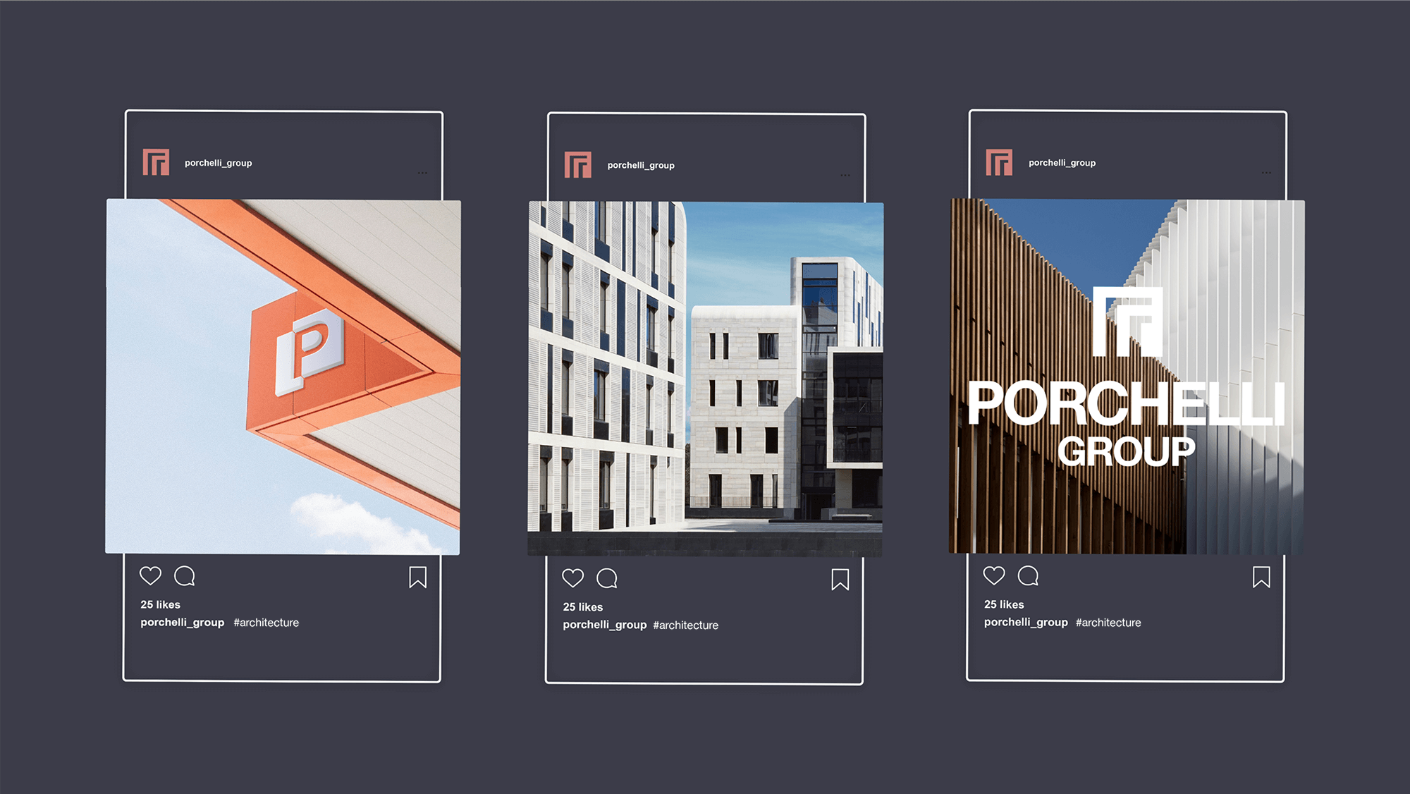
The developed logo is a unique graphic design. The key style-forming element of the logo is its architectural structure, and the visual metaphor is the blocks under construction and the city skyline.

The logo is based on the image of an endless enfilade stretching into the distance, and was created simply by combining russian letters П and Г.